As my magazine is going to be a travel magazine I decided I wanted my magazine to be in a diary/journal style as it is documenting my summer with my family so a professional looking magazine wouldn't fit in with my criteria.
First I started to look at textures on paper for a front cover image.
I looked at leather textures, marble textures and paper textures.
Marble texture: Paper texture:
I decided to choose the paper texture and rotate it to landscape format.
Julie suggested to do typography for a front cover and that's when I decided to have the map of Italy to be included in the front cover as typography.
This was a rough trial of a front cover as I very quickly chose the words to go inside Italy. Some of the words I included were of cities and food.
I decided that the image looked better with the outline of Italy as the words didn't immediately show it was of Italy.
I would like to use this technique for my actual front cover but think of more words for the typography.
For my story articles I will have pictures with them. I want my pictures to look like they have been taken in a poloaroid format.
Here I was testing different fonts to write on the polaroid format with. I wanted a font that looks like it has been handwritten.
Here I was scaling my picture to fit inside the empty polaroid.
This font is called Script MT Bold and the font size is 18.
This font is called Fine Hand and the font size was 18. Here I was deciding whether to keep just the time and date or have some information as well describing the picture.
After a while of me dropping my images into this Polaroid format I found that some of my photographs had to be stretched and people in my images looked huge. So I googled the actual size of a polaroid and found that the template I was using was too big.
First template: Actual size: 3,1/2 x 4,1/2

New polaroid layout with my image in. I decided to change the writing again to Lucida Calligraphy with size 18 pt. I also decided to add captions to my polaroid's to explain a bit more about the photographs if my stories haven't.
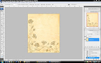
For the individual pages of my magazine I wanted a paper texture instead of a standard lined paper. I googled paper textures and a suggestion was patterned paper which I thought was different and interesting. I couldn't find a papered pattern that I liked so I decided to individually choose a pattern and add it to a paper texture. I choose these:


On Photoshop I merged them together but as the pattern had watermarks I decided to edit them out using the patch tool. When I was satisfied with that I then changed the opacity of the pattern on the paper texture. I then decided to use the same for the opposite double page spread so I rotated the picture horizontally.
I wrote out my story in a word document so I could copy and paste it into InDesign.
Deciding a font size for my writing. I originally chose 18 this size was good for some pages where there wasn't much writing but where there was a lot of writing it took more pages than I wanted it to so I sized it down to 16 pt.
For my headings I changed the colour and made the size 45 pt.
Adding my photographs in: I added a drop shadow to them
Video:
Using premiere pro to edit my videos:
I only used the razor tool which cuts your video and allows you to chop off bits which you don't need such as people pausing or umming.
Adding subtitles to my interview and choosing a font. I chose Microsoft Sans Serif at size 58. I had to add subtitles as my grandma's accent is very strong and not everyone could understand her.
Adding video transitions
Full length of my video:
I decided to make some title pages with what the interview was about:
The font I used was Lucida Handwriting at 100 pt font size. I chose Lucida Handwriting because I had used it on my print magazine for my polaroids so it would link with my video.
At first I had all the writing underlined but I thought it would have looked more effective with just the countries underlined.
I then thought about changing the colour of the countries to see how that would look. I chose orange for Italy because it's warm and sunny and blue for England because its always cold. With the colours so different it didn't look as nice.
So then I decided to have just Italy in white and have the rest of the writing darker to make it stand out. But as I realised after its barely visible against the black background.
So I changed the colour to something closer to white but not too black or grey.
I thought it would look good if 'from Italy' was all in the same font and 'to England' was different to show difference and change.
This is how my title page looked in the end:
Ending page:


.jpg)


No comments:
Post a Comment