For Task 1 we have to research and collect print magazines, tv magazine programs and fanzines for examples to help develop our ideas on making magazines.
My first magazine is called Photo answers from June 1995.
The magazine cost £2 and is an A4 sized magazine. There is a contents page at the front.

It is a magazine that people send their photographs into they talk about what equipment they used such as cameras and additional lenses. Also about what settings the camera was on, how to frame your shot so it’s interesting but how to take better photographs by explaining what is wrong with people's photographs they have sent in.

It is a magazine that people send their photographs into they talk about what equipment they used such as cameras and additional lenses. Also about what settings the camera was on, how to frame your shot so it’s interesting but how to take better photographs by explaining what is wrong with people's photographs they have sent in.
There was a double page spread on Lowe Howard-Spink, Littlewoods advertising company that had explained the process of the final image for one of their advertisements. The advert was of a boat in the sea with 4 women models dressed as sailors with a man model sitting in the back of the boat. I think the image was used for a competition to win a boat ride. They talk about the post production process of combining some of the images they used such as a stationery boat with a boat speeding along making the wave. The photographer is also listed Andy Green. He lists the camera he used and what settings he used on each photograph. It was interesting that they named the software where the images were edited.


Throughout the magazine there are adverts for photography businesses which looks like a section of the yellow pages. This is different to modern day magazines such as fashion magazines as you wouldn't expect it. But it is interesting and different in a good way.

The writing on the pages are quite small but the headlines are very big and bold so they stand out from the writing. Each layout of the pages are different. Some double page spreads have more pictures than others and leaves the other page for the information.

One double page has a symmetrical layout of writing along the outside of the pages with pictures meeting in the middle of the magazine.
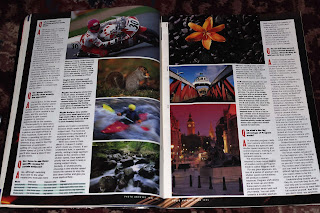
Behind the articles and photographs are coloured borders or photographs.
There is not many adverts throughout the magazine but the ones that are there are promoting cameras and businesses on a full page spread.

I think the magazine is aimed at men and women but over 25 years of age as the layout is full of writing and the adverts with camera equipment has prices on it which a child wouldn't be able to buy anything.

I think the magazine is aimed at men and women but over 25 years of age as the layout is full of writing and the adverts with camera equipment has prices on it which a child wouldn't be able to buy anything.
My second magazine is called Hair Ideas from June 2010.
The magazine cost £1,99. As it is called hair ideas it is about the latest hair trends in 2010. The front cover of the magazine is glossy and it is in A5 format.

The adverts inside the magazine are hair related for example there is one advertising a website where people upload a photograph of themselves and try on hairstyles online.

Other adverts are recommending hair products that top stylists use on their customers such as hair dryers, hair moisturiser, home colouring kit and curl creating moose.
There are many double page spreads on celebrity watch pages where the magazine has chosen the best hairstyles that celebrities have. A double page spread as well on just one celebrity showing her different hairstyles.


Near the front of the magazine is a double page spread on two ladies that have had their hair transformed by stylists of the magazine. The layouts of the two people are similar but mirror imaged because a main picture of them is centred with a small picture of them before the transformation next to their new look with three small images of the process at the top of the page for one lady and at the bottom of the other page for the other lady.


Further on in the magazine there are sections of hairstyles. Some of the sections include '50 most wanted styles'.
For this section there is one image per page with a little bit of text towards the bottom of the page saying what the style is. Some of the writing is in a coloured box with a larger heading than the writing. Whereas on the other page the heading has no information along with it.

For this section there is one image per page with a little bit of text towards the bottom of the page saying what the style is. Some of the writing is in a coloured box with a larger heading than the writing. Whereas on the other page the heading has no information along with it.

There is also a section on just hair colour styles for example if you have blonde hair there are images with different hairstyles and also for other hair colours.
Another section is called 'styles to go' which is divided into 6 categories such as short hairstyles, curly hairstyles, afro hairstyles, bobs, fringes and boys hairstyles.


The layouts of these pages are all different. They have titles for each section and the pictures are almost stuck together with one big image on a single page.


The layouts of these pages are all different. They have titles for each section and the pictures are almost stuck together with one big image on a single page.
Throughout the magazine there isn't much text as it’s mostly pictures of hairstyles. The headings are big, bold and in different colours.
I think the magazine is aimed at women because most of the pictures of hairstyles are for women even though there is a tiny section on men's hairstyles.
My third magazine is called Dare from July/August 2012.
This magazine is a beauty magazine it was free as it must have been inside another magazine. The magazine is slightly bigger than A5.

There is a content page and after that there is an interview with a celebrity from the front cover on three pages.


One page is a big image of the celebrity and the other two pages are the interview with her. There are other interviews with other celebrities too throughout the magazine which are one page spreads with pictures of products they use.


Most of the articles within the magazine are of summer beauty products as it came out in summer. For example a fake tan adverts which is a double page spread with not much text.
Other adverts are for perfume, headache relief, cosmetics and articles on getting smooth skin. These adverts are one page spreads with just titles of the products without writing.


There is two competitions in this magazine and they are located at the back. They are one page spreads and one has many collaged images with lots of writing at the bottom of the page whereas the other competition has 4 images spread out with a chunk of writing next to it.


Looking through a few pages and they are collaged with pictures instead of writing.

Where there is writing some of the headings are in black apart from the first letter of each word and is a different colour and all the fonts are different as you can see in the pictures.

Where there is writing some of the headings are in black apart from the first letter of each word and is a different colour and all the fonts are different as you can see in the pictures.
I think this magazine is aimed at women and teen girls because of the articles that are inside but also the products that are advertised.
My fourth magazine is called Take It Easy from November 2012.
This magazine is from the Sunday People and is a 7 day television guide. It is a free magazine.

There is a content page and as it was an issue from children in need week there is 4 pages at the front of the magazine on how people's donation can help change children's lives. The pages have a border along the top of the pages which are of the Pudsey bears and a big red title to stand out from the small black text. On the first and second pages there are celebrity stories of how they have helped.

On the third and fourth pages are articles on individual children's stories with pictures featured.

Also on the third page there is a yellow fact box about where all the money goes to and how much was raised during previous years. The fourth page of the Children in need article is split by a competition underneath. The competition is to win the latest vacuum cleaner which is a bit inappropriate considering it’s underneath a children in need article.
There is a double page spread on winter fashion such as coats, boots, umbrellas and hats. These are split into 3 columns of 'get the look' with pictures on the left hand side with a title next to the pictures with a small paragraph of writing. Next to the pictures and underneath the titles there are some pictures of clothing with the name of the item, the price and which shop to buy them from. Along the bottom of the page are 6 coats again with name, price and the shop. They have a grey background around them to make the pictures stand out but also to split it up from the other columns of items.
Most of the headings have a white font with a coloured background box around them.
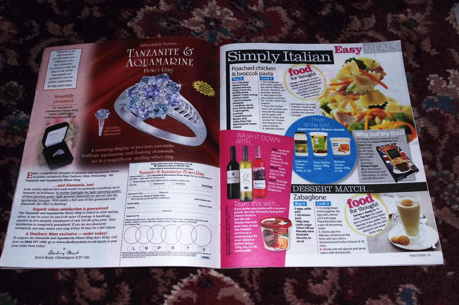
There are 5 adverts all on the left hand side of the magazine and they are of BT broadband, Heinz cup soup, Isme, Electronic cigarettes and a Tanzanite & Aquamarine ring. On the opposite pages to the adverts are articles on sleep, children, comparing make up, Italian food and an article on good wives or bad wives.


After these adverts the Tv guide begins with a double page spread: pick of the best soaps and other programs. These pages have pictures to go with the tv program and there is an interview with one of the characters from EastEnders along the bottom of the first page. The page is very colourful with borders and backgrounds on each tv program. Colours used are blue, hot pink, green, yellow and white.

Then there are 7 pages of tv guides for each day of the week from Sunday the 11th of November to Saturday the 17th of November. Each page is just writing no pictures and has a different colour theme.


After the tv guide are 4 adverts and then a horoscope page.
I think this magazine is aimed at women of all ages but especially above 25 years old.
http://www.youtube.com/watch?v=pFiDgln23g0


This video is an interview of an English man who moved to Poland to live there to teach his mother tongue (English) to others.
The interview is taken outside and it sounds like it is near a road as vehicle noises overpower the man talking so subtitles are there with what the man is saying. In the video only the man is speaking as the interviewer isn't talking and the questions have been typed out. Some of the questions were:
- Why have you chosen Wroclaw to live?
- How long have you been here?
- What surprised you in Poland?
- What surprised you in your workplace?
- Compare differences between living in Poland and UK
The video is 2 minutes and 53 seconds and at the start has a little introduction as to what his name is, the name of the interviewer and how is he helping her with her work. The video has title pages with the questions written out but before the titles appear there is a cross fade. The cross fade effect minimises the sound of the man whilst he is speaking.
http://www.youtube.com/watch?v=45jO7G0EM28


This video is also an interview with a man who lived in England and then moved to Geneva, Switzerland. The interview starts off with a name and it states it an interview, there is no cross fade and then shows a map from where the subject lived to where he has moved. The interview looks like it is taking place in the subjects home which makes his voice nice and clear. The interview starts off with a summary of the man lived in Bournemouth and then went to live in Zurich for 15 years but moved to Geneva. After his summary there is a transition where it looks like a page being turned in a book which is different from a normal cross fade transition. The interviewer is talking in the video but is behind the camera.
The questions asked are:
- What was your first challenge when you arrived?
- Do you consider yourself being successful in integration?
- As you mentioned living here for 17 years you must be very happy so what makes you happy?
- Is there anything missing you find in the town?
- It sounds like you are missing your home town, would you consider living either going back to England or somewhere else?
- If someone came here for a weekend what would you recommend them to do or to see?
The interview is 4 minutes and 35 seconds and the man talks about the tourist attractions in Geneva and compares it to Zurich.
http://www.youtube.com/watch?v=flrkBT_tpzk
This video is an interview of two girls who are walking through their city to find people to interview.
The video starts off like a film showing that they have produced it with credits and other material.


Their video also shows footage of them walking through their city and being in a car journey. The footage starts off slow and then they have made it faster. There is a soundtrack to go along with the video.


During the video they have subtitles as they can't really be heard but also because in their information they said they aren't good at speaking English.
The interview is unedited much as they keep in unnecessary bits.
Their camera is placed at the side of them so they can all be seen by as they are in a cafe a waitress steps in front of the camera.
The interview properly starts at 3 minutes 40 seconds.
Some questions asked are:
- Where are you from?
- Are you on a holiday? How long?
- Do you enjoy staying here?
- Where have you been in Indonesia?
- Are the people there nice?
- What is your favourite Indonesian food?
During the interview the spanish people who they interviewed asked the two girls about their life and what they like.
The video is 18 minutes and 16 seconds long. Their editing techniques at the start and end are interesting.
No comments:
Post a Comment