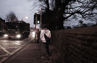
- What are the photographs about? What is the concept?
-Following someone/stalking documenting their activity within a square mile.
- Is there a common aesthetic? How could they be edited to make into a more coherent series?
- Dull toned and muted colours, usually taken from the back of someone.
- Does the order of the images make sense? Do
- es the ordering enhance the concept?
- Yes because the images document the persons journey home.
- What is working well in the series?
- The person being in the centre of the photographs, the similar colour scheme. I like how the main person is usually in focus but there is also movement in the images.
- Which images are working well? Consider this both in terms of communication and aesthetic.
-IMGP25122 - The focus is the subject but he's in the background.
IMGP25112
IMGP24982
IMGP25212 - Good use of the wall giving the feeling of watching someone from behind objects.
I like how his jacket stands out and how they all work together.
- Are there any images that need to be worked on? How? E.g Cropping.
- I don't think they need to be cropped into. I really like how he is usually in the centre of the frame.
- Are there any images that should be removed? Soft/Overexposed/Doesn't fit the series etc.
- IMGP25082 - this image is soft but could be re-shot because it adds to the set the fact that he's getting on a bus.
IMGP25262 - it is slightly grainy.
- What images are missing> i.e. should there be a landscape image to give context? Would deadpan/street images be more suitable?
- More images of the person going other places e.g shops?
Might also be nice to have photographs where the viewer has to look for the subject as they are not obviously the first thing you see.
These are some things I decided to add:
-Spend longer following subjects
Have more shots from far away
Keep the subject in the centre
Don't take a picture after every step ( too many!)
Add captions such as time and date
Here are the images I showed:
IMGP24982
IMGP25002
IMGP25052
IMGP25072
IMGP25082
IMGP25112
IMGP25122
IMGP25161
IMGP25172
IMGP2519
IMGP2520
IMGP25212
IMGP25262
I'm pleased with my feedback because I was able to add another person to my research which was very helpful. I'm pleased that my images conveyed what I wanted them to and that the person reviewing my images disliked the same images I did.


No comments:
Post a Comment